

I can’t believe it! My re-brand is over and I’m SO excited to share it with all of you. It seems silly to me to call it a “re-brand” when I never really had a “brand” in the first place! Soooo… here I am with my first time ever BRAND! Yes, that’s better. Thank you so much to Katie Durski of KD Creative Studios for listening to me, helping me, and guiding me to the final design! Several hundred emails later (237 at this moment), countless hours of brainstorming, looking, choosing, editing, adjusting, and finalizing… we are HERE! There’s SO much I could/want to say about all of it… but that would make for a super duper epic long blog post… so perhaps I’ll tell you a little bit at a time!
In the beginning…
I needed figure out a couple of things about what I wanted my brand to represent. Who IS Brett Denfeld Photography?… not just pretty colors or patterns… but a brand that represents ME as a person and as a business. Katie guided me in choosing colors or patterns that were’t what I “thought” they should be, but to choose something that was REALLY me. For so long, I didn’t know how to define that. I toyed around with so many different colors and ideas … but Katie told me that the first part of narrowing down my vision was to pick 3 words to describe myself, my business, and my brand. I thought about it for a LONG time! I even reached out to family and friends for inspiration. I wanted to see what my audience saw in my work… if it was the same as what I felt. I collected a couple favorites and narrowed it down to:
Thoughtful
Genuine
Inventive
I’ll get into depth about those words in another post because there is a lot to say about them!
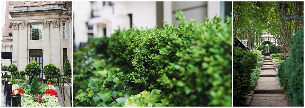
So, moving on… After choosing the 3 words, my next task was to start collecting images for my Pinterest inspiration board. I started searching for words like: travel, letters, classic, boxwoods (I know, random right?! I LOVE THEM!)… and looking through photos that I loved and what I felt my vision to be. Then I started looking deeper… were there common threads? Colors? Textures? As I started collecting and pinning, I found out my colors were much different than what I had originally thought I wanted (blue or purple) … my common colors were green, gold, brown, and tan! Those are SO ME and I didn’t even know it! After my “vibes and ideas” were out there for Katie, we worked on choosing the typography, font, and overall site design.
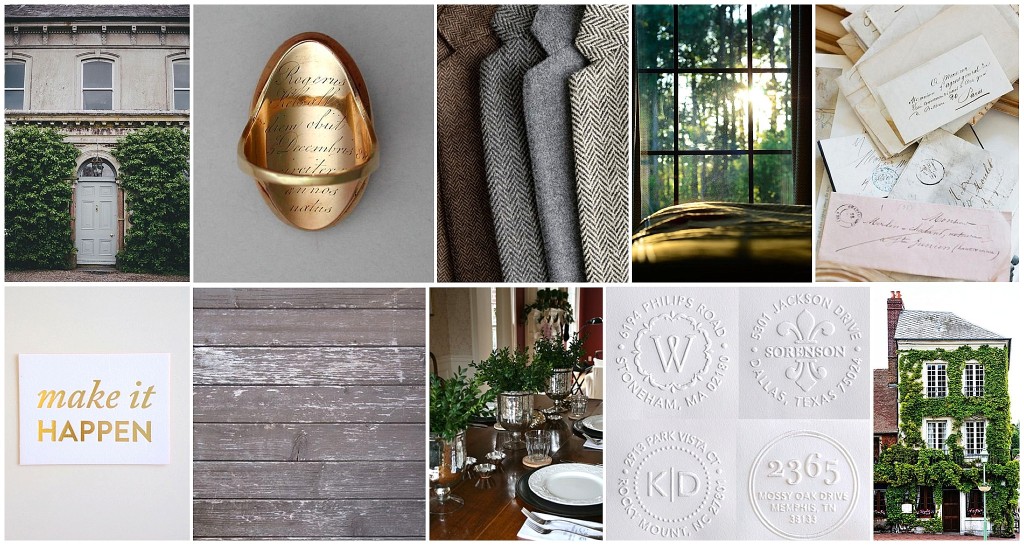
My Pinterest Inspiration board!
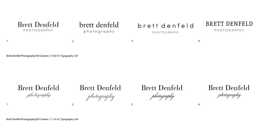
Typography/Logo
Here’s a little glance into some of the typography choices from round 1 to the final round… I knew I wanted a serif font for the “Brett Denfeld” and a pretty calligraphy/cursive font for the “photography”. I like how the “Brett Denfeld” is strong and structured and the “photography” has a little flair of femininity with the cursive style.
Diving into the logo work, I soon realized my love affair for boxwoods, yep, you heard me, boxwoods. I knew I wanted them to be incorporated into the design of my brand somehow and then I started having ideas for it to become a part of the logo! I have loved boxwoods for as long as I can remember… I didn’t always know their name when I was young, but I knew I liked that plant. I like the shape of the leaves, how they can be sculpted into topiaries, and how they can be found anywhere, from the front of my house to beautiful gardens in London. I see them everywhere… and now, maybe you will too!
![]()
The Process…
Throughout the entire process from the beginning until now, I’ve learned a lot about myself. I’ve learned to make decisions based on what I like and not what I think other people will like. I’ve learned to breathe when I start overwhelming myself with possibilities and choices and I’ve learned that communication is important. Well, that isn’t necessarily a new idea… BUT, the way you communicate matters. I had to learn that I needed to be extra “wordy” when it came to giving Katie feedback on my likes or dislikes on different design elements. You quickly realize that it’s hard to write what you mean and have the other person understand. I mean, obviously, right? Your thoughts are unique to you and saying “I like this but I don’t like that” doesn’t get you anywhere unless you spell it out exactly or give examples. The neat part about working with a designer was that I could watch and see how she ran with my inspiration board for each step.
This whole “rebrand process” got me thinking not only about the NOW, but the future too; my plans, my ideas, and my dreams for my business. It’s already almost March, but I can’t WAIT to see what this new year brings! This is a new Brett Denfeld Photography in front of you and I’m excited to have you here!
XO!
Brett